
Predicting a patient’s success
Designing the feature that drove our SaaS sales
My role: Research, UX, data visualization
Project type: Business-facing SaaS dashboard
Collaborators: Clinicians, data engineers, developers, product owner
What if a weight loss doctor could know early on which patients would need more attention to succeed?
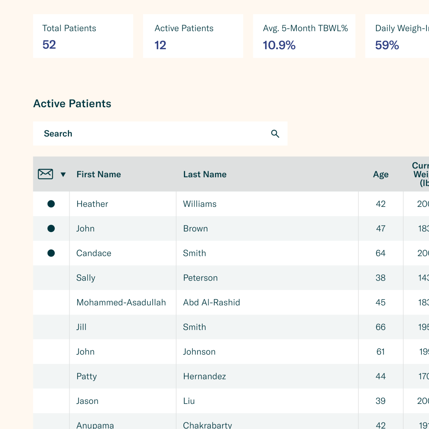
Imagine you’re a doctor at a weight loss clinic with hundreds of patients and a reputation for getting results. Some of your patients are self-sufficient - you give them their surgery/meds and some nutritional advice, and they take it from there. Other patients need a lot more help. If you don’t give them extra support and encouragement, they will fail to reach their weight loss goals and your reputation will suffer.
So how do you make sure all your patients succeed?
You could give lots of attention to all your patients, but you have too many patients for that to be feasible. You need to know which patients actually need the extra help, so you can spend your time where it will have the most impact.
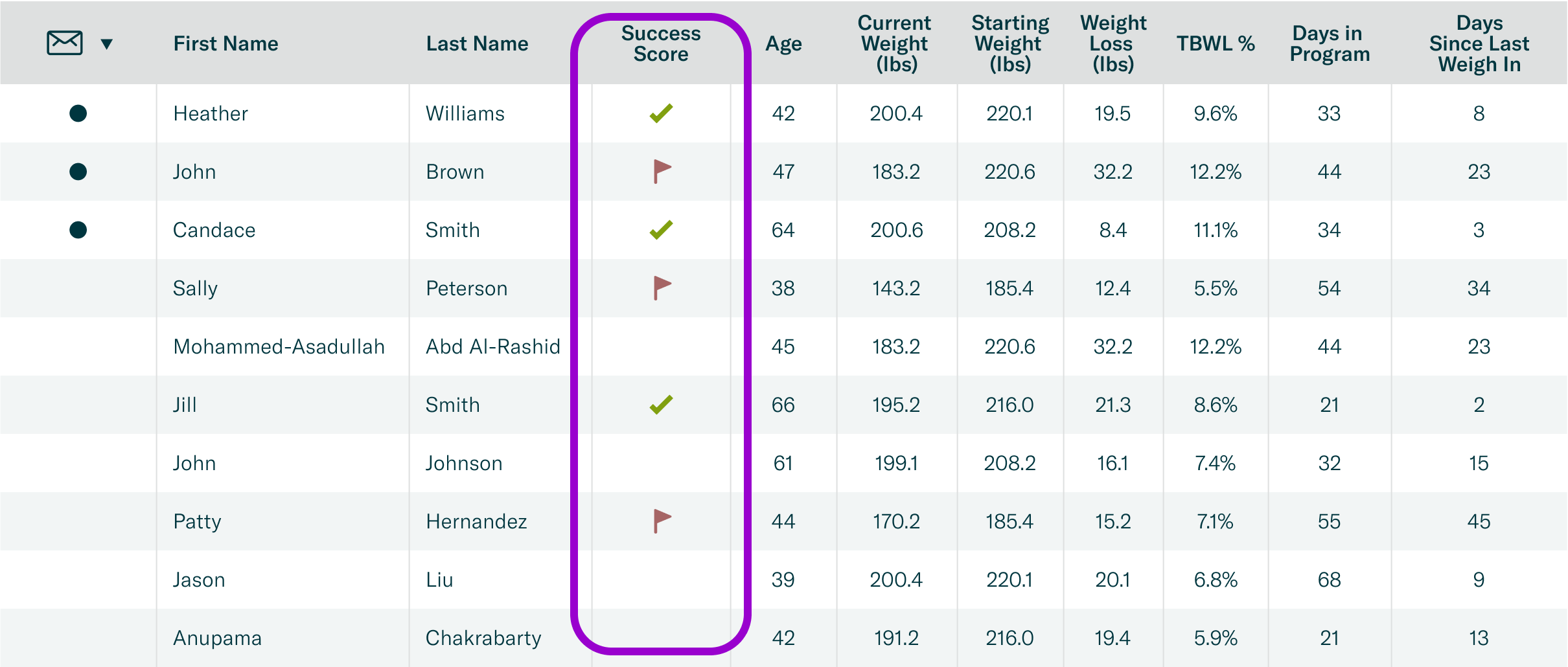
This feature made it easy to identify patients who needed more help.
Clinics loved it, increasing our SaaS sales.
What’s the best way to present this information?
Problem statement
The data science team had already had a way to tell how likely a patient was to succeed with their weight loss.
My job was to figure out how to present this information in the best way.
How could I show a patient’s likelihood of success/failure so that clinicians could easily understand and act on it?

No visual design upgrades allowed
Constraints
I know this dashboard isn’t very pretty. But fixing that was not part of this project.
I had to stay within the visual language we had at the time and focus on the usability of this new feature.
If it has to be ugly, at least I can make it useful.
How to frame it? Risk or success?
Mental models
We initially thought about this score in terms of whether the patient was “at risk” of failing. But then we realized that “risk” has serious connotations in a medical setting so we should avoid using that term for this feature. I tried a few different names and finally settled on “Success Score”. This framed the experience in a positive light, showing that we were concerned with helping patients succeed.
I wanted to make sure this wouldn’t confuse clinicians, so I tested it with clinicians. They were happy with either "risk" or "success", with a slight preference for “Success Score.”
“Success Score” was more in line with our philosophy and clinicians were happy with it, so I went with that name.
How much detail to give?
Ideation
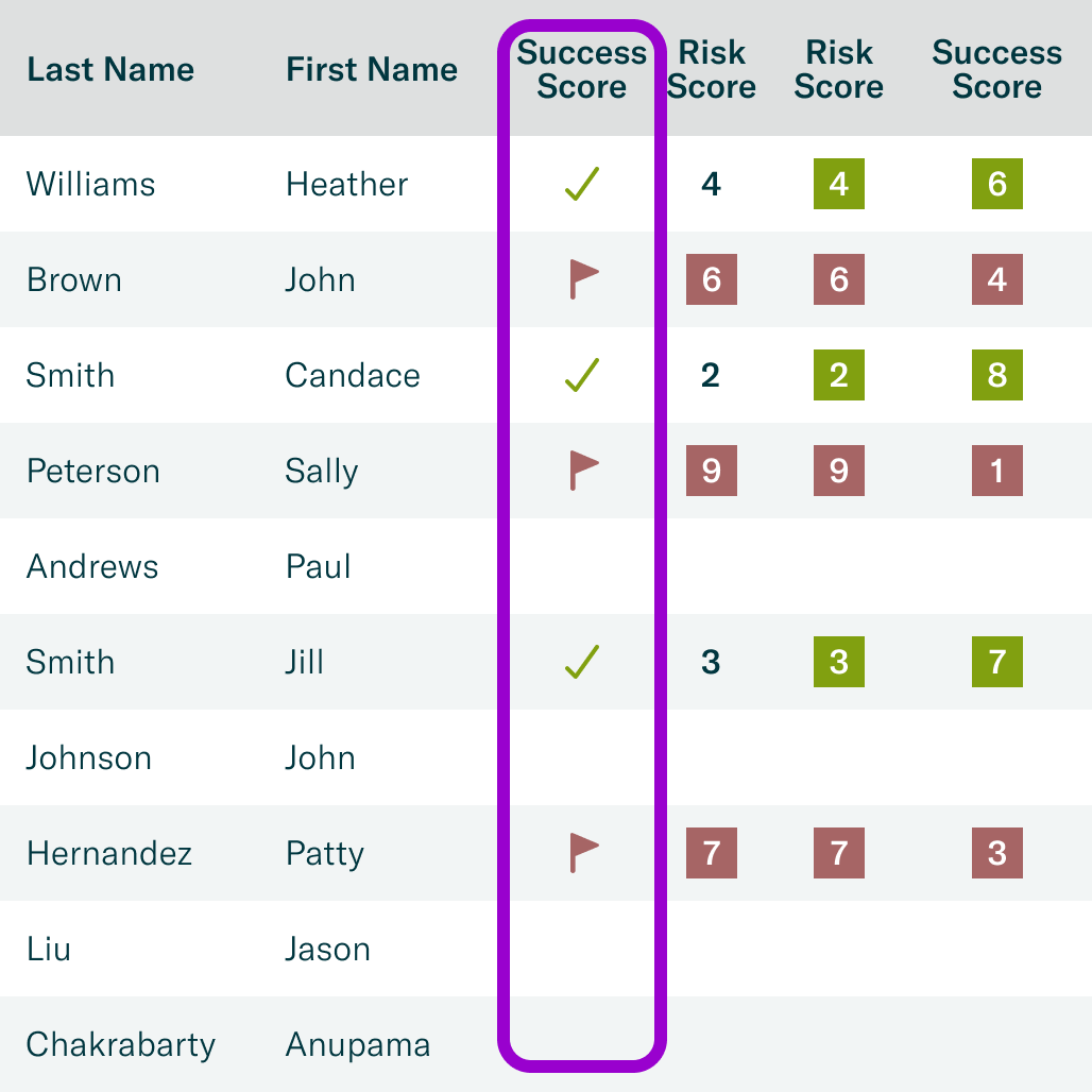
Behind the scenes, each patient got a success likelihood score between 1 and 100, with any score below 60 indicating extra attention was needed.
But, would knowing the exact score help clinicians? Or would so much detail make it harder for them to figure out who needed help?
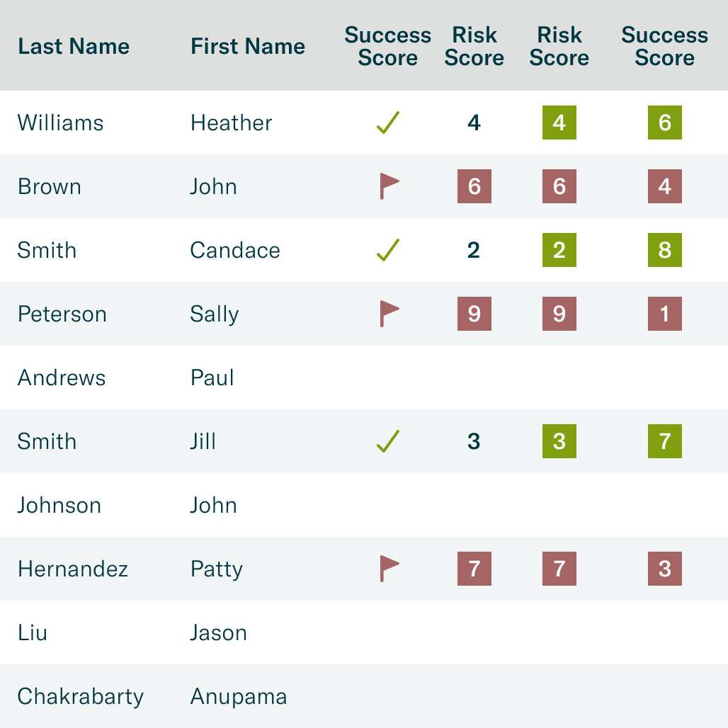
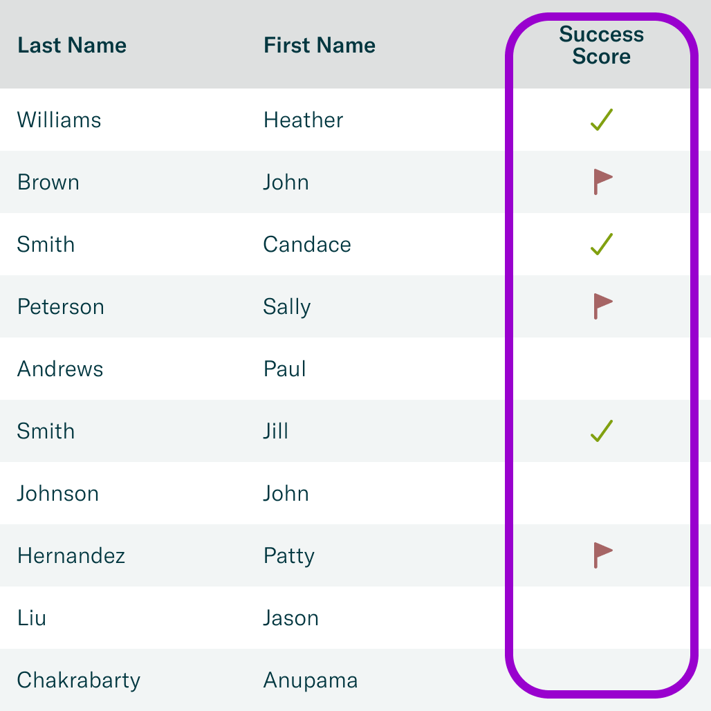
My first idea was a simple ✅ or ❌ indicator, showing that a patient was on track or off track. But in case more detail would be helpful to clinicians, I also came up with a few designs that showed the actual score.
A simple design was my first thought, but I wanted to explore all the options.
What worked best for clinicians?
Usability testing
I tested a few different designs with clinicians, and responses were mixed. Some preferred the simple ✅ / ❌ design and some slightly preferred the number score.
I thought that in the fast pace of day-to-day clinic operations, seeing the numbers would probably slow them down without giving them any substantial advantage.
There was no clear winner, so I went with the ✅ / ❌ design because it was clearest to understand in a fast-paced clinic environment.
Was the Success Score... Successful?
Impact
The Success Score was a huge hit with clinics. They felt that it increased their efficiency and effectiveness. They loved that they could tell at a glance which patients were struggling so they could get them back on track as quickly as possible.
And they were willing to pay for it.
The Success Score became the top reason that clinics wanted to purchase our SaaS product.
What did I learn?
Reflections
My intuitions may be correct, but validating them adds confidence.
My first idea for designing this feature (the check/flag) turned out to be the best one, but I would not have been confident about that if I hadn’t tested it against other ideas.
Experts appreciate curated information.
Clinicians are capable of interpreting more detailed Success Scores, but in this case it would have been more trouble than it was worth. Talking with them let me see that seeing the actual score wasn’t adding much value and simplicity and clarity was the way to go with this feature.